Quick Summary
Learn about designing disasters from the bad website design examples that we have listed here and make sure that you don’t make the same mistakes. We have covered 20 classic website errors that commonly come up so that you can avoid or overcome them. This blog is a learning lesson for you as you wish to build your own website without facing any website design errors.
Table of Index
- Common Website Errors & Bad Website Examples
- #1: Not A Responsive Website Design?
- #2: Navigation Menu Not Up To The Mark
- #3: Page Loading Time Too Slow
- #4: HTTPs Implementation
- #5: Duplicate Page Titles
- #6: No Contact Info Provided
- #7: Interface Design
- #8: Imbalance Between Cluttered Pages & White Spaces
- #9: Not Properly Placed Content Layout
- #10: Fonts Not Visible
- #11: Unable To Read
- #12: Illogical Reading Order
- #13: Undersized Click Areas
- #14: Missing Search Box
- #15: Long Registration Forms
- #16: Lack Of Clear Call-To-Action
- #17: Annoying Pop-Up Menu
- #18: 404 Error
- #19: Orphan And Dead-End Pages
- #20: Not Optimized For SEO
- Key Take Away
- FAQs
Common Website Errors & Bad Website Examples
How would you construct a reliable site?
The key point falls on the plan where a website designer assists you.
Just a second is enough to make a user leave your website if you do not showcase an appealing website design for your business.
We would all be able to concur that the best sites are intended for clients and search engines, correct?
What are some bad influences and common errors for poor website design?
How might you dodge them successfully? In the event you are feeling baffled, are you?
It’s 2026 commencing and would you say that you are as yet influencing those errors for your site to plan which shouldn’t make? At that point, indulge and examine these 20 common website errors to keep away from along with bad website examples.
#1. Not A Responsive Website Design?
![]()
Bad website example: The website of Yale School of Art is not responsive, making it difficult to view on smaller devices. The design appears broken on non-desktop platforms.
The foremost question to be asked is how responsive your website is when it comes to designing? With the advancement in innovation, if your site isn’t enhanced to work over different devices then it won’t emerge to pick up the clients’ consideration.
The reason being, a user hardly refers to the desktop interface to land on your website page.
With on a move situation, it just takes a few seconds for a user to either keep on the website and purchase your product/service or take leave if the website interface is not engaging. In fact, a website with errors related to responsiveness can cause visitors to quickly abandon your site.
Regardless of the site’s requirement, if a website is designed to handle various platforms then it’ll help improve the search engine rankings and user engagement.
Editor’s Note:
With the mobile-first index roll out update, Google made sure that the website so designed is user-friendly to work with multiple devices and will give first priority to mobile index.
Ultimately, with the update, it becomes necessary to get your website ready for the mobile-first index in order to help improve the rankings and indexing.

Co-founder at Glorywebs
Are you interested in Responsive
Website Design?
#2. Navigation Menu Not Up To The Mark
![]()
Bad website example: Arngren.net overwhelms users with chaotic navigation, making it hard to find specific information due to cluttered menus.
The common error to arise for a website design is providing multiple browsing windows which lead to losing your user while encouraging interruption.
Keeping it short and simple, to navigate between the various tabs a navigation menu on every page is required for your website.
Poor navigation leads to the user getting out of sight and jumping over the next website –– your competitors’!
In the case of badly designed websites examples like Arngren.net, the lack of a clear, organized navigation menu can make it nearly impossible for users to locate key information.
Answering the consumer’s question is most important while keeping the navigation tab noticeably aligned at the top or left side of the website page.
If the navigation is not provided in a standard manner then it becomes quite a task to execute the menu in an orderly manner .To avoid this error, consider the examples of bad websites and streamline your website’s navigation to ensure easy usability.
#3. Page Loading Time Too Slow
![]()
Bad website example: Simcast.com has excessive elements on the homepage, resulting in slow page loads, especially on mobile devices.
Notice the fact that impatient people are to be found everywhere which makes more difficult for a website page to take time to load.
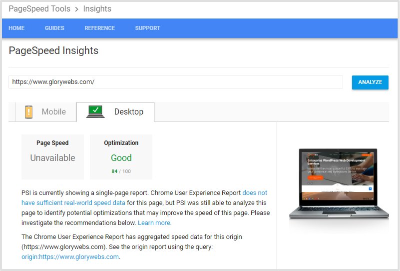
Image SRC: pagespeed
Here are some key site speed killers:
Images that aren’t optimized
Lots of background pictures
Too numerous JavaScript, jQuery, or other extravagant front-end library documents
Editor’s Note:
Now let’s keep it this way if you want to improve your rankings then page speed is the ruling factor as Google rolled out and recommends the use of Speed Update for ranking factor in mobile search.
A point worth noticing is that timing is the key factor for your website, if it takes more time to load then the users won’t hesitate to just take a click away to another website.
You can go through the Google’s PageSpeed Insights to run the speed test for your website and also tools like Lighthouse can bear out to be beneficial.

Co-founder at Glorywebs
#4. HTTPs Implementation
![]()
Bad website example: Websites like Example-HTTP-Issue.com lack proper HTTPS, posing security risks. These websites errors are vulnerable to data breaches or warnings in browsers.
The common error to be seen is not using a secure connection for the website. An https protocol is required to establish an encrypted data connection which secures the personal credentials inserted by the user. Without HTTPS, a broken website example might alert users to avoid your site, damaging both trust and SEO performance.
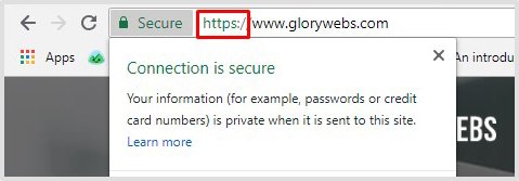
Editor’s Note:
The upgrade has rolled out and if you haven’t upgraded your website from http to https then don’t wait for Google to mark it as not secure site.
Also, check your site with the tools netsparker and SecurityHeaders to verify the SSL certificate and its expiry date.

Co-founder at Glorywebs
Upgrading to https can help boost your website in the rankings and for the SEO search results.
#5. Duplicate Page Titles
![]()
Bad website example: Acme Laboratories’ website reportedly uses duplicate page titles, which can confuse search engines and users
Nobody likes to read the same content over again, especially in a website providing information. After deciding the website’s name, don’t stick with the same repeating title.
Before giving any description, give it a relevant title to offer the user an idea about the information which is provided for the product or service.
To increase users and rankings for your website, avoid using the same titles and fix it as it might be done through the improper setup of URLs.
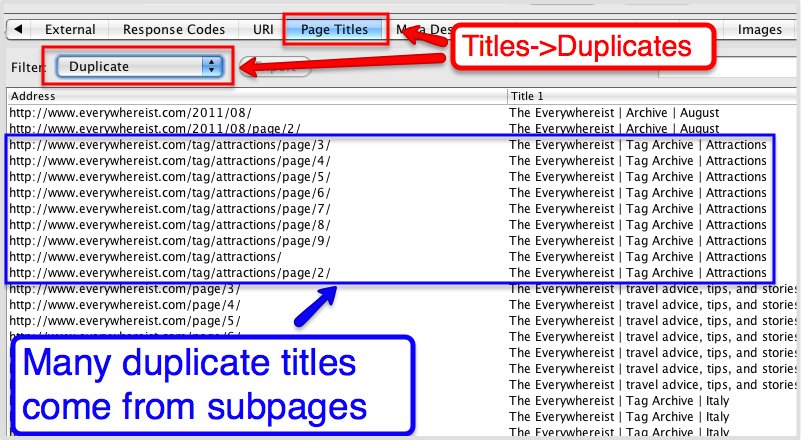
Editor’s Note:
The uniqueness of the title also shows the connection to the search terms used by the consumer. Moreover, for your benefit, understand that using the same context can create a duplicate content issue.

Co-founder at Glorywebs
Ready to Improve? Get a Custom Website
Redesign!
#6. No Contact Info Provided
![]()
Badly designed website examples in this case might be many. In fact many websites lacked proper contact and other info in the past, but eventually everyone updated. Phew. Good for all!
Give your users a way of means on your website to get in touch with you like contact us page. It’s a dead end if the contact info is nowhere to be found on your website.
No one prefers to dig deep inside just to get in touch with you for the products or services offered. This issue is often seen in bad websites examples that fail to include clear contact information, leaving users frustrated and disengaged.
User engagement is the crucial fix for your website to achieve the rankings which eventually involves linking your website to the social media pages and contact information.
Don’t do such a blunder by directing a link for FAQ in the Contact Us page.
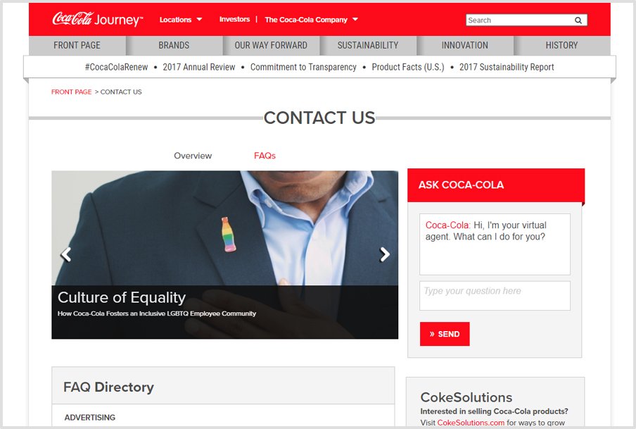
Image SRC: Coca-cola Company
#7. Interface Design
![]()
Bad website example: Blinkee.com uses overwhelming animations and clashing colors, resulting in a poor interface design
The measureless error to happen for your website is designing the interface with all the artistic approaches. No matter what, don’t try to showcase all your design creativity in one place.
It will just end up being a haphazard moment for the user to experience on the website. You should keep it trouble-free securely providing all the necessary information.
With the artistic approach, an elegant look should be maintained keeping your website interface as a medium to have a conversation with your customers.
It should be kept with minimal fonts, colors, and relevant images highlighting the services.
Amazon offers a good grid way to demonstrate the services offered.
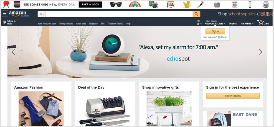
Image SRC: Amazon
#8. Imbalance Between Cluttered Pages & White Spaces
![]()
Bad website example: Arngren.net and pennyjuice.com have cluttered designs that fails to use white space effectively, making the websites visually overwhelming.
A balance between the two most important aspects should be maintained in order to create a mark of a good website design.
Cluttered pages on your website can create confusion within the users not portraying the services provided by your business.
Neither is too many white spaces good enough for your website. Don’t even think to put white spaces as an option to skip out the cluttered pages.
If the designer creates an improper balance between the two then the output can prove to be a sure short blunder like PENNYJUICE.

Image SRC: Penny Juice
#9. Not Properly Placed Content Layout
![]()
Bad website example: Toronto Cupcake’s website suffers from disorganized content layout, making navigation and engagement challenging.
Eliminate the use of long-run texts and keep them short and snappy. Content on your website describes a whole lot of things to your consumer.
The error followed here is the line-up of the content. The content should be so placed and organized in a logical manner.
From the initial approach, a step-by-step follow-up should be provided to keep the user interested in your website and go further deep in it.
LINGsCARS; what are they even trying to say through the website? It’s weird!
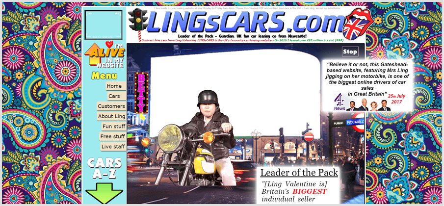
Image SRC: LingsCars
#10. Fonts Not Visible
![]()
Bad Website Design Example: Berkshire Hathaway website features overly simplistic and small fonts that fail to provide adequate readability.
The most common errors to consider for the website design are the font size. In order to keep the website to its minimum, don’t blow the cover for it.
Let’s just say the font size is kept to its minimal not providing the user a proper location which will end up losing the users’ interest in the product or service offered by you.
Fonts create a readable platform for your website which can result in a great advantage to go for if the designer plans it accordingly.
Don’t let a situation arise where the customer thrives back to get a magnifying glass just to read your text on the website. Give it a suitable readable font and size to ease out.
The worst example of a website can be seen in these two.
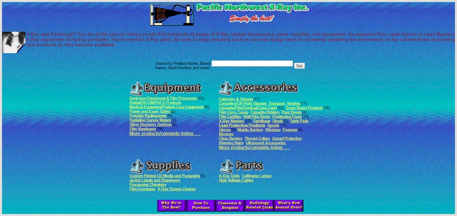
Image SRC: PCWX
#11. Unable To Read
![]()
Bad website example: Gates N Fences website and Windowns93.net are literally unable to read websites. Websites like Windows93.net employ overly strong background colors that clash with text, reducing readability.
What is the use of designing a website from where a user cannot access your product or service? To gain more users the website should offer readable data with its simple yet effective design.
Not too much, not less it should be in between to make the person understand and get a quick access to your website.
It’s gameplay to be handled by the font size which is kept for the text on your website.
PS: It’s not my fault but the website is really not up to the mark.
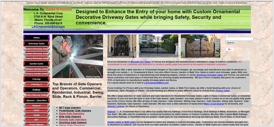
Image SRC: Gates N Fences
#12. Illogical Reading Order
![]()
Bad website example: Paulo Coelho’s Blog has inconsistent layouts that disrupt natural reading flow.
One of the other essential website errors to make is not keeping a sequence for your context.
No visitor will take interest in your website unless and until the reading structure is displayed as it should be.
When the description is designed for the website, a logical order shall be maintained so that the user doesn’t lose interest in your site.
Define the flow of the order of your content to showcase the relevant information that is required on your website.
The sequence for the website will keen the user to know more about the service or product.
What are they expecting us to do?
#13. Undersized Click Areas
![]()
Bad website example: Many poorly optimized older websites suffer from this, where buttons are small and not optimized for touchscreens (specific examples include legacy travel booking sites).
Links are provided as a channel for the user which needs to be firmly established on the page for user engagement.
If the area of the click is not visible enough, the visitor will shift to a new website.
Suggestion:To guarantee we get an extensive clickable area, we could either make the entire link greater or increment the padding around the connection utilizing the CSS “padding” property.
#14. Missing Search Box
![]()
Bad website example: Websites requiring excessive fields during sign-ups, like certain healthcare portals, frustrate users.
The initial search of the user goes for the search box to find the exact information that they are up to.
Not providing a search box will create chaos for the user to navigate between the pages to find the information they are looking for. The search box shall be kept at the top so that it catches the user’s eye to find the details within.
A search box within the website can get it in the search results.
eBay displays care for their customers by providing a search within the tool.
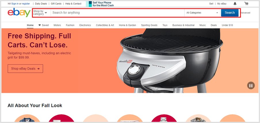
Image SRC: eBay
#15. Long Registration Forms
![]()
Bad website example: Websites requiring excessive fields during sign-ups, like certain healthcare portals, frustrate users.
This is an online portal, not the offline mode where you can ask for irrelevant information from the users once they want to fill up a form.
You shall provide a tab for the email sign up which is far more relevant in front of the lengthy, not useful forms submission.
Some forms are also marked with an unnecessary asterisk mark in order to make that space to be filled compulsorily which frustrates the user.
A simple version can be kept in this way.
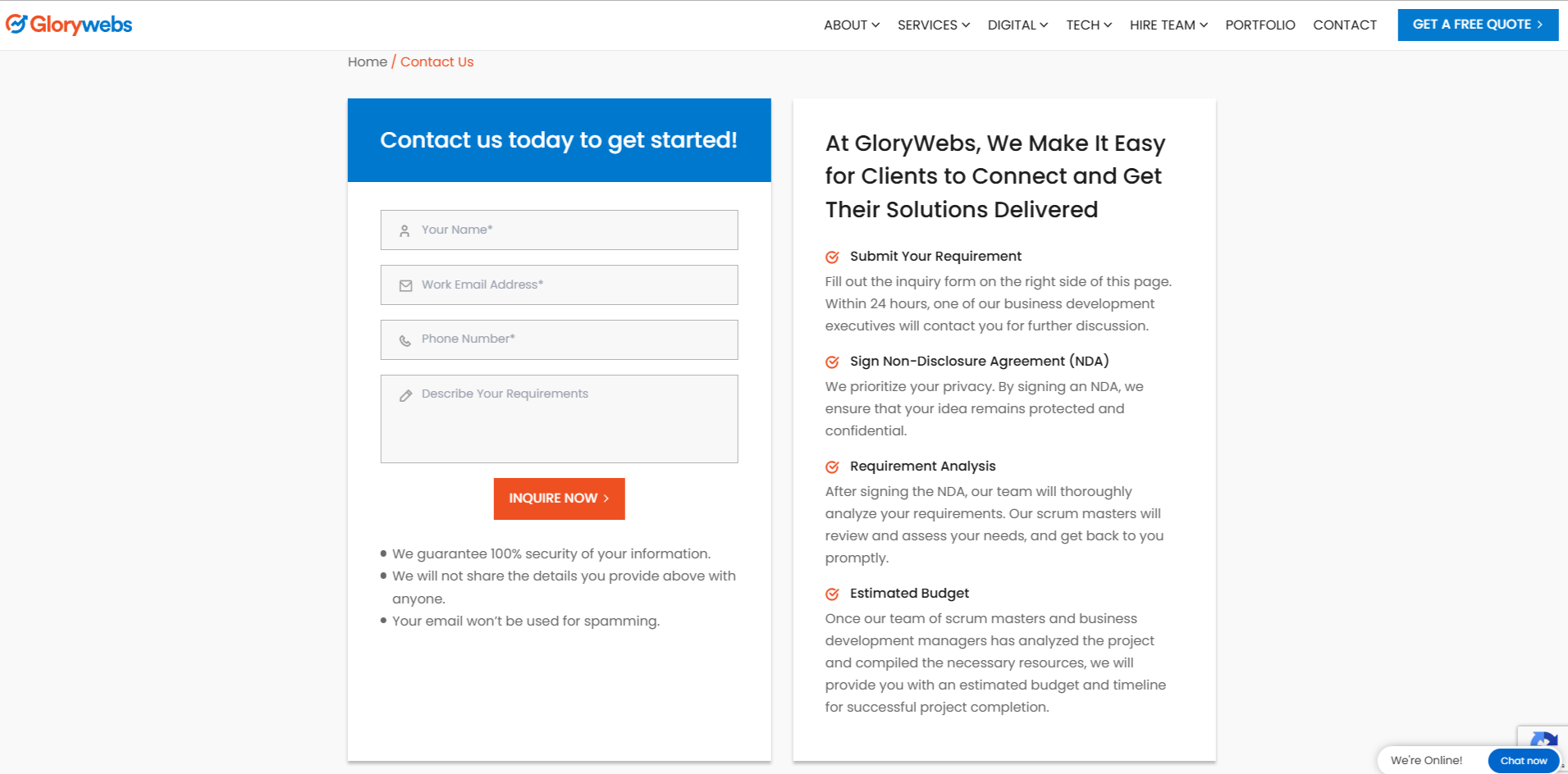
Image SRC: GloryWebs
#16. Lack of Clear Call-To-Action
![]()
Bad website example: Stack Exchange, Spy House Coffee, and Toronto Cupcake does not include clear CTAs, hindering user conversions.
A lack of a clear call to action is one of the huge mistakes to create havoc for your website.
The user going through your website needs to understand the message you’re trying to convey with the help of a clear call to action.
Make sure that too much is also harmful; provide the visitors with the appropriate information linking a call-to-action for it.
It’s not a coding game that you’ll play with the valuable visitors through your website.
A bad example can be seen in the two images.
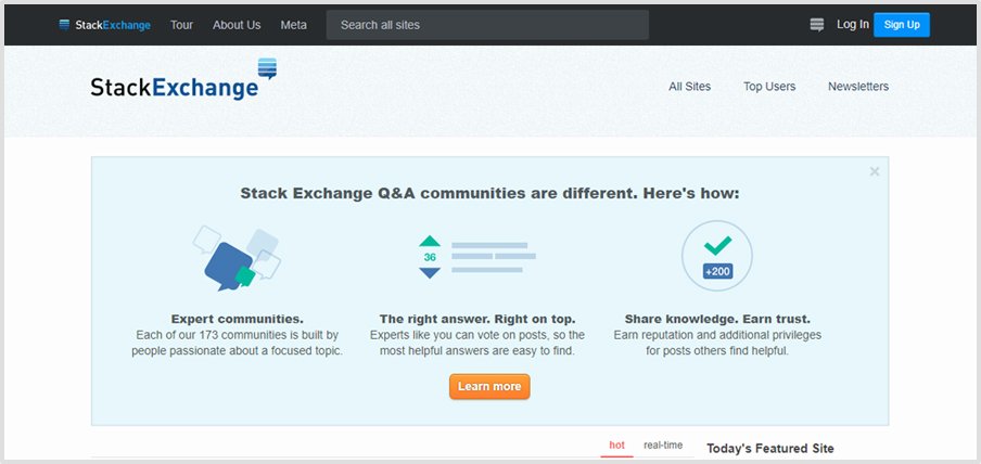
Image SRC: Stack Exchange
Avoid These Errors—Get Your Website
Audit Now!
#17. Annoying Pop-Up Menu
![]()
Bad website example: Express Readers and Kam Kartway websites overuse pop-ups which is annoying for the users. However, over the time, they have reduced the usage of pop-ups.
One of the user annoying things to create a bounce for your website is the pop-ups menu.
Pop-ups create a no-tolerance rate and sometimes also develop confusion amongst the audience. It can cause the website to slow down.
As soon as you open up the website this annoying pop-up opens up as shown in the examples without even giving any access to the homepage.
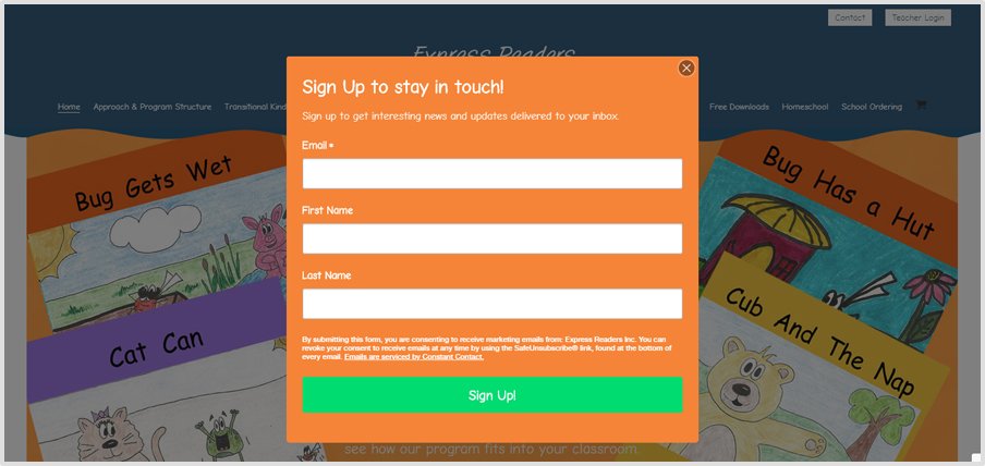
Image SRC: Express Readers
#18. 404 Error
![]()
Bad Website Design: Broken links leading to 404 pages are common on websites with outdated or unmaintained content, such as some blog archives.
Generating a large number of 404-page errors when you remove or broken any page can affect the ranking of your website in a negative prospect.
Even when you make a mistake while typing a URL can lead to the broken link of 404 error pages. This kind of error will make you lose the visitors.
How redirecting can help your website, look forward to a few examples.
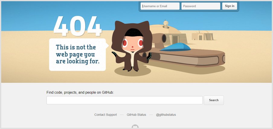
Image SRC: Wiki
#19. Orphan And Dead-End Pages
![]()
Bad Website Examples: Pages on Simcast.com reportedly lead to dead ends without navigation to return to key areas.
When website pages that are not linked to another section of your site, having no or less content, are under construction then these can be considered as an orphan or dead-end page.
They cannot be found by search engine crawlers, and they represent missed opportunities to acquire and engage customers.
#20. Not Optimized For SEO
![]()
Bad Website Examples: Berkshire Hathaway’s site lacks modern SEO practices, such as meta descriptions, proper tagging, and structured data.
If you want the customer to value your website, alternatively optimize for SEO instead of delaying and completing it at the end.
Prepare a full SEO audit plan for your website.
You can take the help of various free and paid tools to make sure that your website is fully optimized.
Editor’s Note:
SEO plays a crucial role in your website which you need the most. There are numerous SEO factors that can help you optimize your website and get in the top rankings.
You can also make use of the Technical SEO Tools giving you guidelines.

Co-founder at Glorywebs
Are you interested in Responsive
Website Design?
Key Take Away
That implies you never should forfeit magnificence over capacity, or the other way around.
While there can be a few other regular web design mess up that the plan of your site would have submitted, these are the basic ones with top to a bottom effect on your business’ general execution in the market.
You additionally need to take mind that nothing goes over the board with regards to building up a one of a kind and practical site for setting up a solid reputation for yourself in the market.
FAQs
Responsive design ensures that your website looks and works seamlessly across all devices, including desktops, tablets, and smartphones. It improves user experience and boosts your site’s SEO ranking.
Slow-loading pages increase bounce rates and reduce user engagement. They can also negatively impact your SEO ranking, as speed is a key factor in search engine algorithms.
Without HTTPS, a website is marked as insecure by browsers, discouraging users from visiting. It also leaves sensitive data vulnerable to interception and harms SEO performance.
Cluttered designs confuse visitors, while poor navigation makes it difficult to find information. This leads to lower engagement, higher bounce rates, and lost conversions.
Orphan pages have no internal links directing users to them, making them inaccessible. Dead-end pages fail to provide navigation options, frustrating users and hurting SEO.
Without clear CTAs, users may struggle to understand the next steps, leading to lower conversions. Effective CTAs guide users toward desired actions like signing up or purchasing.
SEO optimization ensures that your website ranks higher in search engine results, driving organic traffic. It includes elements like meta tags, alt text, keywords, and content quality.



Comments