
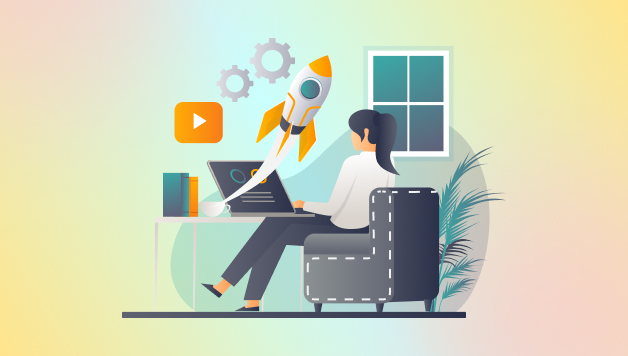
Quick Summary:
A high-converting SaaS landing page transforms website visitors into paying customers. Whether promoting a CRM platform, an AI-powered tool, or a team collaboration app, the landing page is the first step in the user journey. This blog explores what makes the great SaaS landing pages successful, showcases seven top-performing landing pages for SaaS design samples, and provides practical best practices and tips to help you create a results-driven landing page for SaaS.
Table of Content
- Introduction
- What is a SaaS Landing Page?
- Key Elements of a High-Converting Landing Page for SaaS
- How is a Landing Page Different from a Homepage?
- Top SaaS Landing Page Examples: Takeaways & Insights
- How to Create Your Own SaaS Landing Page
- High-Converting Best Practices of SaaS Landing Page
- Best SaaS Landing Page Templates to Kickstart Your Design
- Tips to Choose the Right Landing Page Template for SaaS
- Wrapping Up
- FAQs
Introduction
In the competitive world of SaaS, first impressions have a direct impact on conversion rates. A well-crafted SaaS landing page guides users toward a single action with clarity and intent. It combines compelling messaging, user-focused design, and a streamlined layout to encourage sign-ups, demo requests, or free trials.
Whether launching a new SaaS product or scaling an existing one, all types of landing pages must align with business goals and user expectations. This guide breaks down the essential elements of high-performing landing pages for SaaS, highlighting real-world examples and outlining proven techniques that drive better engagement and results.
What is a SaaS Landing Page?
A SaaS landing page is a standalone web page created to drive a single, focused conversion goal. Unlike a homepage, which often includes multiple navigation paths and general information, a landing page is designed with one purpose—prompting the visitor to take a specific action, such as signing up for a free trial, booking a demo, or subscribing to a newsletter.
In the SaaS industry, landing pages play a crucial role in generating leads and acquiring users. These pages serve as targeted entry points, typically tied to a specific campaign, ad, or user intent. They are stripped of distractions, keeping the user’s attention on the core value proposition and the call to action.
A well-executed landing page for SaaS communicates what the product does, who it’s for, and how it solves a problem. It utilizes persuasive copy, strong visuals, and trust-building elements to establish credibility and drive conversions. According to Unbounce’s Conversion Benchmark Report, the average conversion rate of a SaaS landing page is 3.8%, which is the lowest among other industries. However, let us examine how to achieve the best results as we move forward.
Key Elements of a High-Converting Landing Page for SaaS
Creating an effective landing page is essential for converting visitors into customers in the competitive SaaS landscape. Here are the key elements that make a landing page not only attractive but also highly effective:
- Clear and Compelling Value Proposition: Communicate immediately what your SaaS product does and why it matters. A concise, benefit-driven headline paired with a subheadline helps visitors quickly understand your unique value.
- Engaging Hero Section: The hero area is the first thing visitors see. Use a clean layout with strong visuals and a focused message that captures attention and encourages exploration.
- Strong Call-to-Action (CTA): Your CTA should be clear, persuasive, and easily accessible. Use actionable language that encourages users to take the next step, whether it’s signing up, starting a trial, or requesting a demo.
- Product Demo Video or Animation: Instead of static images, show your product in action with a demo video or animated walkthrough. This builds clarity and trust by visually demonstrating how your SaaS solves problems.
- Features & Benefits: Don’t just list what your SaaS can do—show users how it makes their lives easier. Highlight core features alongside the real-world benefits, so visitors immediately see the value and understand how your product fits into their workflow.
- Social Proof: People trust people. Featuring customer testimonials, recognizable logos, or quick case studies adds credibility and reassures potential users that others have seen actual results.
- Responsive Design: Your landing page should look great and function flawlessly on any screen, including desktops, tablets, and phones. A responsive design ensures everyone gets the same smooth, high-quality experience.
- Clear Messaging & Flow: Keep things simple and purposeful. Walk users through the page with messaging that flows naturally and builds interest, making it easy for them to understand what’s next, without overwhelming them.
- Contact Form: Some users have questions or just want a direct line. Including a straightforward, accessible contact form shows you’re open to conversation and makes capturing leads easier.
- User Experience (UX): Speed matters. So does ease of use. Fast-loading pages, intuitive navigation, and friction-free design keep users engaged and prevent drop-offs. A solid UX turns casual visitors into actual customers.
Bringing these elements together on your landing page creates more than just a good first impression—it builds an experience that connects with users and encourages them to take action. When you clearly show the value of your product, back it up with real-world proof, and guide visitors with purposeful CTAs, you turn interest into trust—and trust into conversions.
Just don’t set it and forget it. The best landing pages are constantly evolving. Continue testing, tweaking, and refining based on user behavior to ensure your page remains aligned with what your audience truly wants.
Your landing page is your first impression—make it count!
Our expert-designed SaaS landing pages are built to engage and convert.
How is a Landing Page Different from a Homepage?
Landing pages and home pages are very distinct, even though many people use them interchangeably. The home page is the primary page of your website, much like the hallway that the front door leads to. A landing page, on the other hand, is a single page created and utilized for a specific campaign.
The following table lists the eight primary distinctions between a home page and a landing page:
| Aspect | Landing Page | Homepage |
|---|---|---|
| Purpose | Focused on a single conversion goal (e.g., sign-up, demo request) | Provides an overview of the brand and multiple offerings |
| Content | Highly targeted, minimal content focused on one message | Broad content covering various products, services, and info |
| Navigation | Limited or no navigation to avoid distractions | Full navigation menu linking to all site sections |
| Audience Intent | Visitors from specific marketing campaigns or ads | General visitors with diverse intents (exploration, support, info) |
| Call-to-Action (CTA) | One or two clear, prominent CTAs focused on conversion | Multiple CTAs directing to different areas or actions |
| Design Focus | Simple, streamlined, distraction-free layout | Rich, informative, and navigational layout |
| Measurement | Optimized and measured for conversion rates | Measured for engagement and overall site traffic |
| Examples | Free trial signup page, webinar registration | Main website homepage with product and company info |
Top SaaS Landing Page Best Practices Examples: Takeaways & Insights
Examining successful landing pages can reveal how top brands craft a seamless, persuasive experience. The following cases highlight diverse messaging, design, and functionality approaches that drive conversions.
1. Notion
Notion’s landing page features a clean design with a minimalist layout that immediately communicates its core value: an all-in-one workspace for notes, tasks, and collaboration.

Industry: Productivity / Collaboration
Highlights:
- Minimalist Aesthetic: A clean, whitespace-heavy layout draws attention to core messaging.
- All-in-One Messaging: Focuses on Notion as a unified space for docs, databases, tasks, and collaboration.
Components:
- Hero Demo Video: Allows users to see the product in action.
- Focused CTA: “Try Notion Free” in a prominent button.
- Visual Hierarchy: Subdued design guides the eye naturally.
Why It Works:
Notion’s landing page shines through its simplicity. The clean, minimal layout strips away distractions and puts the spotlight squarely on what matters—Notion’s promise to streamline workflows and keep everything organized in one place.
Bonus:
As you scroll, subtle animations add just the right touch of interactivity. They bring the page to life without pulling focus or overwhelming the experience.
What We Love:
Notion’s clarity and elegance mirror the actual product UX — that’s perfect brand alignment.
2. Slack
Slack’s landing page combines vibrant visuals with a benefit-driven copy to position its platform as the ultimate team communication hub.

Industry: Team Communication / Collaboration
Highlights:
- Human-Focused Copy: Emphasizes team productivity and better communication.
- Visual Use Cases: Short videos and illustrations tell the story of team interaction.
Components:
- Multiple CTAs: From free signup to product tours.
- Logos & Testimonials: Social proof from brands like Target and Airbnb.
- Animated Screens: Make intangible benefits (such as ease of communication) visual.
Why It Works:
Slack’s page matches its product’s energy — dynamic, collaborative, and easy to adopt. It educates visitors without overwhelming them and converts different buyer personas with segmented CTAs.
Bonus:
Micro-copy under CTAs helps clarify what happens next.
What We Love:
Slack nails the emotional appeal: it doesn’t just show features; it shows better workdays.
3. Airtable
Airtable’s landing page emphasizes visual storytelling and interactivity, showcasing its versatile database and project management capabilities.

Industry: No-Code / Database / Project Management
Highlights:
- Visual-First Layout: Brings database capabilities to life via visuals.
- Workflow Transformation Messaging: Shifts focus from data to real-world productivity.
Components:
- Interactive Product Previews: Users can engage with a live demo on the homepage.
- Modular Sections: Breaks down features without overwhelming.
- Responsive Design: Seamless across mobile and desktop.
Why It Works:
Airtable translates technical functionality into approachable solutions through interactive design. It doesn’t just explain — it shows how workflows improve.
Bonus:
Use-case-driven sections help niche audiences imagine themselves using the tool.
What We Love:
The balance of simplicity and power makes databases feel creative.
4. Grammarly
Grammarly’s landing page leverages social proof and a clear demonstration of its product benefits to build credibility and trust.

Industry: EdTech / Writing Assistant
Highlights:
- Credibility-Driven: Heavy use of ratings, testimonials, and expert validation.
- Instant Understanding: “Write with confidence” explains the benefit in 3 words.
Components:
- Real-Time Demos: Interactive corrections help users understand the tool’s power.
- Media Mentions & Reviews: Builds trust fast.
- Quick CTAs: “Add to Chrome – It’s free.”
Why It Works:
Grammarly builds trust through instant product clarity and extensive social proof. It reassures skeptics and appeals to both casual and professional writers.
Bonus:
Dynamic before/after examples show the real impact of Grammarly.
What We Love:
It shows precisely how the product helps, not just what it does.
5. HubSpot
HubSpot’s marketing software landing page is designed to cater to various user segments through precise segmentation and tailored messaging.

Industry: Marketing / CRM / Sales
Highlights:
- Segmented Messaging: Custom content for different industries and business sizes.
- Authority Signals: “Used by over 100,000 businesses” adds credibility.
Components:
- Interactive Product Demos: Let visitors test-drive before signing up.
- Multiple CTAs: “Talk to Sales” for high-intent users, “Try Free” for explorers.
- Detailed Use Cases: Industries, company sizes, and teams are addressed separately.
Why It Works:
HubSpot respects that one size doesn’t fit all. Its landing page matches varied buyer intents and offers clear navigation paths for each.
Bonus:
HubSpot Academy promotes learning alongside product use — a masterstroke in retention.
What We Love:
Their segmentation strategy feels personalized without being overwhelming.
6. Jasper
Jasper’s landing page highlights its AI capabilities and how they simplify content creation, making it a prime example of an AI saas landing page.

Industry: AI / Content Generation
Highlights:
- AI-Powered Productivity: Messaging centers on speed and ease, leveraging AI for enhanced efficiency.
- High-Tech Appeal: The page visuals and copy align with the innovative product tone.
Components:
- Before & After Examples: Showcase Jasper’s writing transformation power.
- Free Trial CTA: Low-friction entry into the product.
- Interactive Hero Section: Allows users to experiment with sample prompts.
Why It Works:
Jasper uses interactivity to generate excitement around AI. It combines strong visual metaphors with clarity on how it helps content creators.
Bonus:
Live chat offers AI-generated suggestions — even the support uses Jasper.
What We Love:
It speaks directly to marketers and creators with a strong, aspirational tone.
7. Webflow
Webflow’s landing page demonstrates the potential of its design platform by showcasing visually striking layouts and real-time project examples.

Industry: Web Design / Development
Highlights:
- Creative Showcase: The landing page showcases what’s possible with Webflow.
- Bold Typography & Visuals: Reflects modern design trends.
Components:
- Hero Animation: Illustrates responsive designs in motion.
- Success Stories: Highlight how authentic brands have used Webflow.
- Sticky Navigation: Smooth UX with persistent CTAs.
Why It Works:
Webflow’s landing page practices what it preaches. By designing a stunning page with its tool, it builds credibility through example.
Bonus:
Case studies are linked contextually throughout the page — a smart use of internal linking.
What We Love:
The landing page itself is a living testimonial — no better proof than that.
How to Create Your Own SaaS Landing Page
Creating a focused and well-designed SaaS landing page is key to turning visitors into customers.
- Define a Single Conversion Goal: Focus on one explicit action (e.g., free trial signup, demo request) to avoid confusing visitors.
- Craft a Compelling Headline: Communicate your SaaS’s unique value with a strong headline and supporting subheadline.
- Design an Engaging Hero Section: Place a concise value proposition, a strong CTA, and a product visual above the fold for instant impact.
- Highlight Features and Benefits: Use bullet points or icons to showcase key features alongside their user benefits.
- Incorporate Social Proof: Add testimonials, client logos, or case studies to build credibility and trust.
- Optimize for Mobile: Ensure your landing page is fully responsive and offers a seamless experience on all devices.
- Use a Clear and Persuasive CTA: Make your call-to-action prominent with action-oriented text and contrasting colors.
- Implement A/B Testing: Regularly test different headlines, call-to-action (CTA) buttons, and visuals to optimize saas landing page conversion rate.
- Utilize Landing Page Builders: Use tools like Unbounce, LeadPages, or Webflow for easy creation and testing of landing pages.
High-Converting SaaS Landing Page Best Practices
Building a successful landing page for SaaS isn’t simply a matter of good design or clean code—it’s about making sure every element speaks to what your users are looking for. The most effective SaaS companies know this and focus on removing roadblocks, earning trust, and guiding visitors toward action with purpose and precision.
Focus on a Single Conversion Goal
A successful landing page for SaaS is laser-focused on one objective. Whether that goal is to collect emails, book demo calls, or push users into a free trial, everything on the page should support that single outcome. Multiple CTAs or conflicting goals create cognitive overload and confusion. A single, streamlined funnel increases clarity and boosts conversion rates. Remove top navigation, unnecessary links, or alternate pathways that could distract the user from the primary action.
Use Benefit-Driven, Action-Oriented Copy
Rather than listing technical specs or complex features, speak directly to the value your product provides. Users want to know what’s in it for them. Replace “Feature-rich dashboard” with “Manage your entire workflow from one place.” Use clear, compelling, and relatable language to describe user problems and how your product solves them. Keep paragraphs short, use bullet points to break up text, and maintain a natural, human tone.
Make the Call-to-Action Impossible to Miss
The call-to-action (CTA) is the most crucial element. It should visually pop and appear strategically throughout the page, typically after every significant scroll section. Use high-contrast colors that align with your brand but still draw attention. Avoid vague language like “Submit”; instead, use precise, actionable phrases like “Start My Free Trial” or “Book My Demo Now.” If a form is involved, keep it short—each additional field can reduce conversions by up to 10%.
Build Trust With Social Proof and Security Signals
Trust is a key conversion lever. Including social proof such as testimonials, user ratings, or logos of well-known customers creates a sense of reliability. Showcase real success stories from users who’ve benefited from your product. Add third-party review badges (e.g., G2, Capterra), and emphasize security and privacy with certifications (such as SOC 2 or GDPR compliance). Include micro-copy like “No credit card required” or “100% risk-free trial.” These elements reduce anxiety and reinforce credibility.
Optimize for Speed and Mobile Experience
A sluggish or clunky experience will cause users to bounce, especially on mobile. Optimize your SaaS landing page with the right landing page optimization tools to achieve fast load times by compressing images, removing unnecessary scripts, and utilizing efficient code. Ensure full mobile responsiveness with layouts that adjust cleanly across all screen sizes. Buttons, forms, and CTAs should be easily tapable. Remember: over 50% of web traffic comes from mobile devices, and performance has a direct impact on SEO and conversions.
Use Product Visuals That Educate and Demonstrate
People need to see your product in action to believe in its value. Use screenshots, recordings, or short demo videos highlighting key features and use cases. Interactive previews or animated walkthroughs can further boost engagement. Avoid generic stock images—users respond better to tangible interfaces and use-case examples. Add contextual copy near visuals to guide users through what they see and explain how it benefits them.
Leverage A/B Testing for Continuous Improvement
The first version of your landing page is rarely the final one. Use A/B testing to experiment with various headlines, call-to-action (CTA) placements, hero images, layouts, and more. Start by testing one element at a time to isolate the impact. Use tools like Google Optimize, Optimizely, or VWO to track performance and iterate continuously. Conversion rate optimization is an ongoing process, and the insights gained over time can lead to significant growth.
Guide Users With Strategic Page Flow
Your landing page should follow a logical structure that mirrors a persuasive conversation. Begin with a compelling headline and subheadline that clearly outline the value proposition. Then, present the problem, introduce your product as the solution, showcase social proof and benefits, and conclude with a strong call-to-action (CTA). Use visual hierarchy—headings, spacing, icons, and imagery—to guide the user naturally from one section to the next. Each scroll should reinforce interest and encourage users to take action.
When these SaaS landing page best practices are applied cohesively, they create a smooth, intuitive, and persuasive experience that drives results. The key is continually testing, refining, and aligning your page with what your users need and expect.
Unlock higher conversions with data-driven CRO strategies.
A/B testing, user insights, and expert tweaks can take your SaaS business to the next level!
Best SaaS Landing Page Templates to Kickstart Your Design
Creating a high-performing landing page isn’t something that happens overnight—it takes time, experimentation, and a solid grasp of what motivates users to take action. That said, working from a well-tested template can give you a serious head start. A strong template comes pre-optimized for conversions, providing a sleek and professional layout that you can easily tailor to fit your product, brand voice, and messaging.
Below is a curated list of the best platforms and templates specifically designed for SaaS businesses, ranging from startups to enterprise-level tools.
1. Webflow Templates
Webflow blends design freedom with responsive, clean code. It’s a no-code builder yet powerful enough to deliver professional-grade websites without needing a developer. Webflow templates are popular among SaaS founders because they come with modern UX/UI and are built with performance in mind.
What to look for in Webflow templates:
- Modular sections for easy rearrangement
- Built-in CMS (great for a blog or case studies integration)
- Animations and scroll interactions
- Optimized for SEO and fast load speeds
Top Webflow SaaS Templates:
- SaaSly – Sleek, minimal layout perfect for B2B SaaS
- LaunchKit – Designed for product launches with clear CTAs and pricing blocks
- Stratus – Features modern gradients and visuals for tech-forward SaaS startups
- Nimbus – Ideal for showcasing AI and data-heavy tools
Best for:
Startups are ready to launch a sleek, responsive site without hiring a dev team.
2. Unbounce Templates
Unbounce is explicitly built for landing page conversions. Every template is optimized for A/B testing, speed, and lead generation. It integrates easily with CRMs, email platforms, and analytics tools, making it great for performance marketing campaigns.
What to look for in Unbounce templates:
- Form-heavy designs with strong CTA placements
- Pre-built A/B testing functionality
- Lead capture pop-ups or sticky bars
- Fast-loading pages tailored to PPC traffic
Top Unbounce SaaS Templates:
- BoldSaaS – Focuses on social proof and value propositions
- Appify – Mobile-first, excellent for showcasing apps and dashboards
- ConvertFlow – Designed to increase free trial signups and demo requests
Best for:
Marketers running paid ad campaigns or growth teams are optimizing landing pages for conversions. Learn how to choose the best between Unbounce and Leadpages.
3. Carrd Templates
Carrd is one of the fastest and simplest platforms for setting up a one-page landing site. It’s lightweight, budget-friendly, and ideal for SaaS MVPs or pre-launch waitlist pages. While it’s more limited in functionality, it’s perfect for quickly validating ideas.
What to look for in card templates:
- Clean, one-goal layouts (signups, waitlists, etc.)
- Email integrations (e.g., Mailchimp, ConvertKit)
- Lightweight design for fast mobile performance
- Affordable pricing and an easy-to-use editor
Top Card SaaS Templates:
- SaaSify – Built for clear value messaging and direct CTAs
- SimpleStack – Excellent for showcasing early-stage tools
- StartOS – Waitlist template with product teaser section
Best for:
Founders in the early validation phase or solo entrepreneurs looking to launch quickly and inexpensively.
4. Framer Templates
Framer combines beautiful design with interaction-rich features, such as animations and transitions. AI or modern tech startups often use their templates to convey innovation through design. You can publish directly from Framer without a developer, making it an excellent choice for design-centric teams.
What to look for in Framer templates:
- Scroll-based animations and micro-interactions
- Modular components that adapt to content flow
- Figma import for design team collaboration
- Built-in analytics and SEO controls
Top Framer SaaS Templates:
- Promptly – Explicitly built for AI tools and prompt-based products
- NeonSaaS – Bold visuals and modern typography with dark/light modes
- Flex UI – Modular layout for SaaS products with lots of features or use cases
Best for:
Modern AI tools, creative SaaS products, or brands that want to make a visual impression.
5. Figma UI Kits for Custom Development
If you’re building a custom site with a development team or using Webflow and Figma in tandem, starting with a Figma UI kit or landing page design system can significantly speed up the process. These kits often include ready-to-use components, such as headers, call-to-action (CTA) elements, pricing tables, testimonials, and more.
What to look for in Figma SaaS kits:
- Well-organized design systems
- Pixel-perfect layout components
- Color themes, typography sets, and iconography
- Mobile-first layout compatibility
Top Figma Kits for SaaS Landing Pages:
- Untitled UI – Comprehensive and scalable for entire SaaS platforms
- Setproduct SaaS Kit – Focused on startup launch and app onboarding
- Flowbase UI Kit – Pairs perfectly with Webflow for quick handoff
Best for:
SaaS companies working with internal design/dev teams and looking for total customization.
Tips to Choose the Right Landing Page Template for SaaS
Using the right SaaS landing page template saves time and ensures you’re building on a foundation of proven design patterns. Whether validating an idea or optimizing a mature product’s conversions, these templates give you the edge to go live faster, with confidence.
- Know your goal: Select a template with a layout that supports your core action, such as trial signup, demo request, or waitlist capture.
- Match your brand style: Select templates that align with your tone—whether professional, playful, bold, or minimalist.
- Prioritize mobile and speed: Over 50% of users will view your page on a mobile device. Make sure templates are lightweight and responsive.
- Check customization flexibility: Some templates are plug-and-play, while others require more tweaking. Choose based on your team’s skill set.
- Start lean, then scale: Launch quickly with a simple template. As your product evolves, update your design to reflect the addition of new features and user personas.
Wrapping Up
Designing a high-converting SaaS landing page extends beyond just making it visually appealing. It’s about understanding what your users want, delivering your message clearly, and building trust through thoughtful design choices. Whether you’re drawing inspiration from successful SaaS pages, following time-tested strategies, or accelerating progress with innovative tools and templates, the goal remains the same: to guide your visitors toward a single, explicit action.
Today’s most effective SaaS brands maintain clean, focused, and engaging landing pages, striking the perfect balance between interactivity and credibility. And with the right strategy, there’s no reason you can’t do the same. If you’re looking to take things to the next level, working with a top-tier landing page design agency can help you create a polished, high-performing page that drives results. Focus on the user, fine-tune every part of the journey, and your landing page could become a serious growth driver for your product.
FAQs
A SaaS landing page is a standalone web page designed to convert visitors into users, leads, or customers for a Software as a Service (SaaS) product. Unlike a homepage, a landing page for SaaS focuses on a single, specific action, such as signing up for a free trial, booking a demo, or starting a subscription.
Begin with a clear value proposition, engaging visuals, social proof, and a compelling call-to-action (CTA). Keep the design simple and focused on one goal. Using real-world SaaS landing page examples for inspiration and partnering with a Top Landing Page Design Agency can help you create a professional, conversion-optimized page.
The best SaaS landing pages use outcome-driven messaging, real-time product visuals, customer testimonials, trust badges, and mobile-optimized design. A/B testing headlines, CTAs, and layouts continually improves performance and increases conversions.
High-quality SaaS landing page templates are available on platforms like Webflow, Unbounce, Carrd, and Framer. These templates are designed with responsiveness, speed, and conversion in mind, allowing you to launch quickly without sacrificing quality.
A Top Landing Page Design Agency brings UX, conversion optimization, and SaaS-specific user behavior expertise. They help craft landing pages that look stunning and strategically guide users to take action, ultimately increasing your sign-ups, demos, and sales.


Comments