Insightful significanceMobile First
Getting your Website Ready for the Mobile-First Index

Are you aware of Google’s new release to make your website ready for Mobile-First Index? This can be possible in early 2018. Trust me it is a key to offer a great mobile user experience.
If you have still not received satisfactory information about Mobile-First Index and how does it help you to lead a better website?
Then, you have landed at the right place!
Today, we will discuss how you need to be prepared for this new release and implement it to your website. Also, we can help you to implement on your website and added step by step process which you can follow in website development.
But being just ready for the move isn’t just enough! Follow some skillful tactics to ensure that your site is not only ready to maximize the conversions but can march ahead of the competition.
Before beginning, we will learn what difference it creates and how does it make your website super-super engaging.
So, let’s get started:
1. Why Mobile-First Index?
With this move, Google is just encouraging webmasters to go responsive to their websites with the Mobile-First Index roll out.
But it is necessary to learn what the benefits are of this new launch.
Google’s Mobile-First Index means that it will soon organize search results based on the mobile version of websites. The main reason behind it is Google has noticed mobile users outweighed the desktop search and will continue to grow in future.
Another reason is a lot of inconsistency in desktop and mobile version of websites like less amount of content on mobile websites. Google recognized it as a serious issue for mobile users.
2. What is changing with Mobile-First Index?
According to the graph representation by Statistia, the number of mobile users is increasing day by day. Google realizes that the use of internet on mobile device exceeds desktop worldwide.
For creating better business one has to focus on the mobile version of the site. This means the user will be seeing lesser information compared to the content on the website. Also, it will provide the noteworthy results in SEO industry.
For instance, if you are a real estate agent with thumbnails of current listings present on the home page of your site you may want to scale back the amount of information on your homepage rather than clutter a small screen with lots of data that is nearly impossible to read. Better to have a few listings and links to direct users to information on other, complementary pages. These pages will be indexed along with the home page on the Google’s Mobile-First Index Environment.
Hence, after Accelerated Mobile Pages, this is the next step by the giant to improve the mobile user experience.
3. Preparing for Mobile-First Index
- Manage Content in Mobile-Site
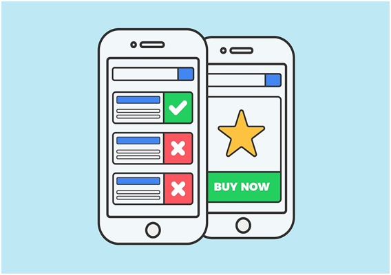
Image source: Pixabay
If your website has two different URL for desktop and mobile respectively then Mobile-First Index will create a huge impact on your SEO rankings in the first place. This is because many of the websites use separate m. domain to manage mobile experience. Your current rankings are given on the basis of your desktop content. But if you’re mobile version misses those in the Mobile-First Index Environment it can affect the SEO insights of your site.
Here, I have noted down some tricks and tips to maintain mobile content and ensure relevant user engagement.
- Work on Popup Blocks – Ensure pop-ups do not appear often disturbing the reader
- Use Drop Down – Hide the access content in the drop down to make it look neat and visible
- Finger Friendly Content – Make sure you size your tap targets correctly and allow enough padding between those tap targets
For instance, if the page loaded on the mobile does not manage the content in a readable format, it might fetch the information from the other website which adversely affects your ranking in the SEO industry in accord with the Mobile-First Index feature.
- Speed Up the Site Process
When it comes to customer conversions and overall user experience (UX), we recommend starting with your site speed, specifically focusing on mobile. Firstly, conduct a full audit of your mobile site and then analyze it properly to carve a new process in order to make it well-performing.
There are ways which you can opt for in the future to achieve expected SEO results and make your user experience more engaging and reliable. Some are mentioned as under:
- AMP- Accelerated Mobile Pages – It allows you to load your web pages lightning fast compared to HTML
- PWA-Progressive Web Apps – It is an alternative to AMP users. It takes care of the web page reliability, loads them fast and allows impressive UX (User Experience).
For instance, if one uses to AMP, he can find the difference it brings in the time taken by AMP landing page and regular landing page. This is how it affects the mobile-first world.
- Make your Mobile-site Friendly
To stay high in the eye of Google, you need to follow structured markup information such as price and review ratings to make it more analytical and formatted. Because you have two separate code bases you may only have this information on desktop site.
Again, in order to maintain the information on search results, it’s important to be indexed the mobile site version. Google has previously said that content that’s not deemed mobile-friendly will not rank as well. It boosts the content for mobile listings using a special mobile ranking system.
Quick steps to make your content mobile-friendly:
- Use a structured format to display content
- Make use of expandable content for mobile version
- Add relevant information to specific content of each page
For instance, structured data of any website is more favorable to have a quick read by a mobile user rather than a website with poor alignment. This how it becomes mobile friendly and gets indexed by Google.
- A Responsive Website Design is Must

Image source: Pixabay
Many websites have different personas that vary across device types. Considering the Google’s new update of Mobile-First Index, mobile URL needs to point towards the responsive pages. It is possible when switching from m-dot to mobile responsive.
Here are some of the tips to make your site responsive:
- You need to remove your rel=”alternate” tags
- Also, remove mobile alternate references in your sitemap
- Implement the 301 redirects to move the content from old URL to redirected page
- Setup each page’s rel=”canonical” so they are pointing to themselves
For instance, if your site has two different layouts for desktop and mobile respectively then, it can create conflicts over different information provided. Make sure you redirect it to responsive pages with expected consistency.
- Equivalent Content on Mobile and Desktop Version
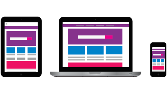
Image source: Pixabay
Most of the users cut down the content or detail features in the Mobile site version compared to the content available on the web version. This indirectly confuses the user about the relevant information and degrades the user experience.
All of this results in major changes in the Google ranking when the Mobile-First Index goes live. So, assure equivalent content on both of the platforms for a clear idea.
Some tips to organize equivalent content:
- Use expandable content views such as Drop down menu
- Make use of tables, or graphical representation
- Follow a structured layout for an organized data
For instance, when the user prefers online purchase from the Mobile-site version, less of the product information or offers details compared to the desktop might affect your sale.
- Don’t Block CSS, JavaScript or other Images
Avoid blocking the CSS, JavaScript, and other images. The reason is pretty simple. Mobile site version will show loading if they contain such elements.
Moreover, some of these elements could often lead to slow loading as well as display issues and it actually made more sense to hide them from GoogleBot on mobile. Hence, Google can handle it well and categorize your rankings appropriately.
Do take care you don’t hide anything to avoid loading time.
For instance, if your mobile site version doesn’t allow CSS, JavaScript then the user might get disturbed due to the display issues and increased load time or can move to the other site.
Summary
The above description guides towards few of the steps to be taken care while optimizing the website for Mobile First-Index. Completing it makes sure you are Website Ready for Mobile First-Index.
To sum up, to optimize for the mobile-first index, companies will have to shift to mobile-first thinking in everything they do – design, development, UX – and then worry about desktop later.
So, start today in order to really embrace the mobile environment. If you are genuinely considering the next development and design change, leave your desktop aside!
I hope reading this article was useful. Do let me know in the comment box below to make it more engaging.
Stay tuned for more updates.
Have a great day ahead! 🙂
Comments